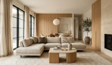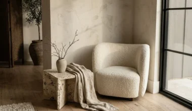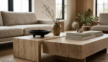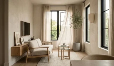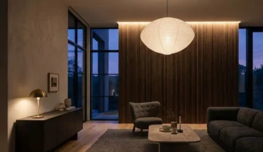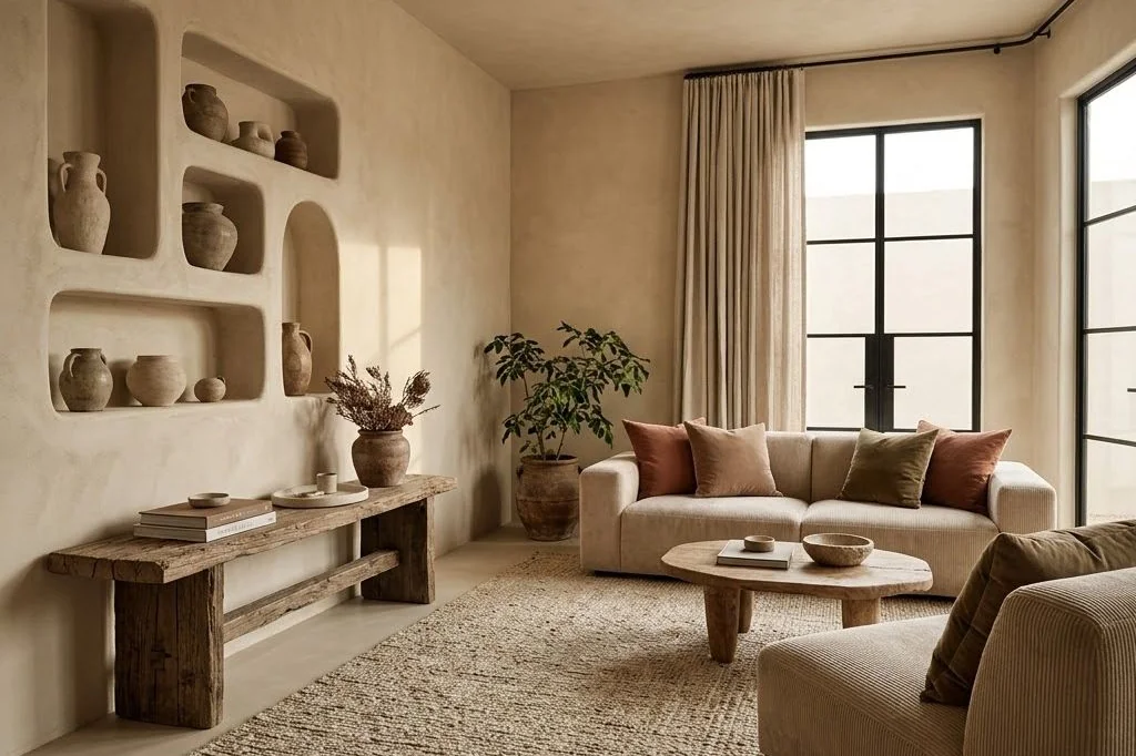
An organic modern living room color palette draws inspiration directly from the natural landscape, translating geological formations, raw clays, and weathered timbers into a deeply calming domestic atmosphere. Rather than relying on stark, icy gallery whites or high-contrast chromatic accents, organic modern color theory focuses on tonal layering and atmospheric subtlety. When warm neutrals and grounded earth pigments interact with natural sunlight, a living room transforms into a timeless sanctuary that feels both articulate and serene.
Key Takeaways
Guiding tenets for establishing a harmonious earth-tone color scheme:
- Structuring rooms around the 60-30-10 ratio creates visual hierarchy while maintaining monochromatic calm.
- Selecting warm whites with subtle creamy and taupe undertones avoids clinical glare and muddy yellow casts.
- Introducing rich terracotta and raw ochre accents adds warmth without disrupting serene spatial balance.
- Muted botanical greens, such as olive and dried moss, integrate biophilic tranquility into living areas.
- Slim matte black or dark charcoal architectural details ground light spaces, providing crisp definition.
The 60-30-10 Organic Color Formula: Warm Foundations
Balancing neutral palettes requires a disciplined structural framework to prevent spaces from feeling either disorganized or washed out. Interior architects employ the classic 60-30-10 ratio, calibrated specifically for natural materials. In an organic modern living space, 60% of the room represents your dominant foundation – typically lime-plaster walls, ceilings, and large architectural drapery in a soft alabaster or warm ecru tone. For architectural inspiration and spatial balance, explore the Ornista homepage.
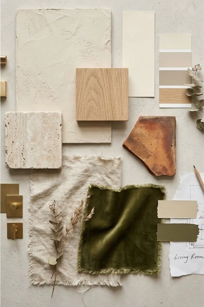
The secondary 30% encompasses mid-tone natural textures: wide-plank white oak flooring, honed travertine or limestone coffee tables, and substantial oatmeal linen upholstery. The final 10% provides the critical accent layer – consisting of deep terracotta stoneware, olive velvet throw pillows, and patinated bronze lighting hardware. This distribution ensures that every surface has an intentional role, cultivating an effortless transition across interconnected zones.
Decoding Warm Whites: Avoiding Yellow and Sterile Grey Pitfalls
Selecting the right white paint is one of the most consequential decisions in residential design. Pure white with blue undertones can appear harsh and clinical, resembling a sterile gallery under shifting weather conditions. Conversely, heavy cream paints with strong yellow undertones can look dated and heavy under warm interior lamps.
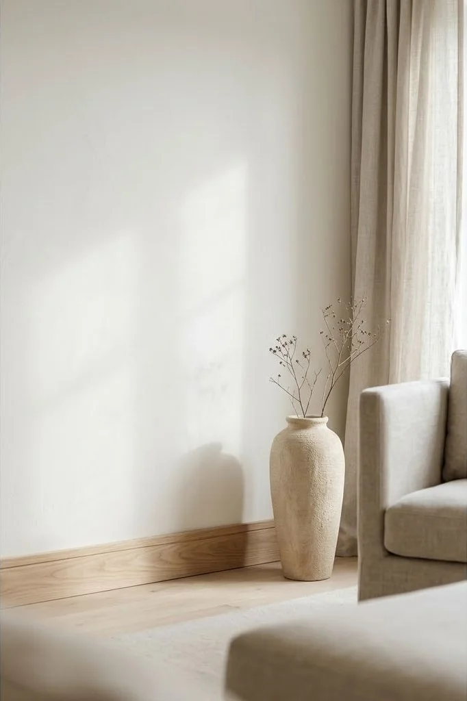
Seek out complex, chalky whites featuring subtle taupe, gray-green, or bone undertones. These pigments absorb harsh glare during midday hours while glowing softly at sunset. When evaluating paint samples, paint large 24-inch poster boards and test them on opposing north-facing and south-facing walls across morning, afternoon, and evening lighting. For detailed guidance on pairing pigments with tactile finishes, study our analysis on the art of texture layering in organic modern living rooms.
Earthy Accent Tones: Terracotta, Ochre, and Muted Sienna
While neutral foundations set a peaceful tone, rooms require grounding accents to evoke warmth. Earth pigments derived from iron oxide and natural clay minerals – such as Tuscan terracotta, burnt sienna, and warm desert ochre – introduce organic vitality without clashing with minimalist aesthetics.
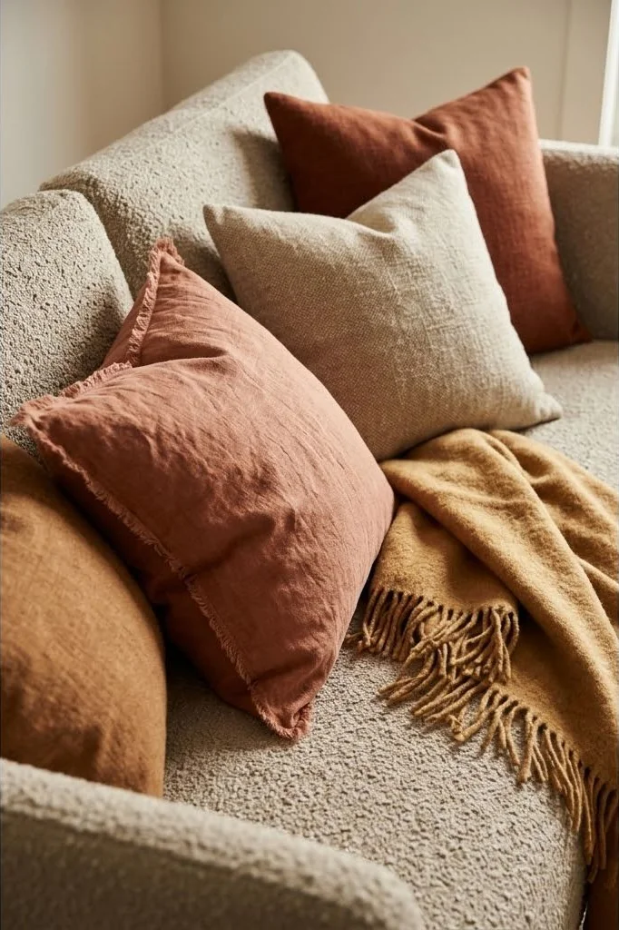
Introduce these clay hues through washed Belgian linen pillow covers, textured wool throws, or handmade terracotta urns displayed on low oak shelves. Because these pigments share common geological origins with sand and stone, they harmonize naturally with bleached oak and travertine surfaces. This connection to the raw earth keeps the room feeling grounded rather than artificial, as celebrated in architectural features across Architectural Digest.
Biophilic Hues: Incorporating Dried Moss, Olive, and Sage
Nature rarely presents itself in monochrome; it is interwoven with subtle botanical greens. In an organic modern living area, green tones should feel muted, desaturated, and slightly weathered rather than bright or synthetic.
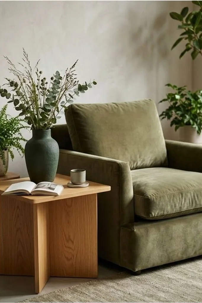
Colors like dusty sage, dried moss, and silvery olive green serve as visual bridges connecting interior spaces to exterior garden views. Incorporate these tones through a low-profile velvet accent chair, a textured ceramic centerpiece holding wild grasses, or the natural foliage of an indoor olive tree. Muted green elements lower visual heart rate and provide soothing optical resting points across the room.
Architectural Grounding: Black and Charcoal Anchoring Elements
An interior composed entirely of pale creams and light woods risks feeling floaty and indistinct. To give an organic room structural backbone and visual weight, deliberate moments of deep contrast are essential.
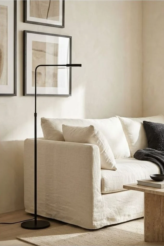
Incorporate slim matte black or dark charcoal accents through blackened iron curtain rods, slender floor lamp stems, or the thin frames of architectural artwork. These black elements function like punctuation marks in prose: they draw the eye, define boundaries, and accentuate the soft luminescence of surrounding white plaster walls. To understand how contrasting fixtures interact with nighttime illumination, explore our breakdown on sculpting warmth with organic modern living room lighting rules.
Wood Tone Harmony: Blending Light Oak, Walnut, and Reclaimed Elm
Many homeowners worry that mixing different wood species in one space will look messy. However, restricting a room to a single timber species often results in a rigid showroom feel. The art of organic design embraces harmonious wood blending.
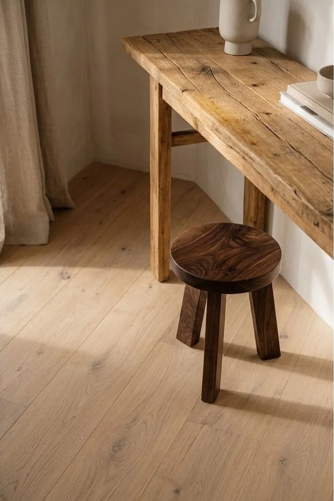
The secret to successful wood blending is matching undertones rather than exact grain darkness. A light European white oak floor pairs seamlessly with a dark American walnut side stool and a rustic reclaimed elm console table, provided all three timbers carry warm golden or neutral undertones rather than red or orange finishes. This gentle gradation of wood values imparts an authentic, collected-over-time character that feels genuine and timeless.
In addition to timber and wall paints, architectural stones like travertine, limestone, and raw slate introduce subtle micro-veining that connects furniture to the earth. When stone surfaces echo the color temperature of your wall plaster, the entire space reads as a cohesive geological sculpture rather than a disparate assembly of store-bought furnishings.
Frequently Asked Questions
What is the difference between organic modern and standard minimalist palettes?
Standard minimalism often relies on high-contrast cool whites, polished greys, and reflective black surfaces. Organic modern palettes embrace warm chalky whites, earthy taupes, textured woods, and clay pigments that prioritize sensory comfort and natural warmth over stark geometric purity.
Can cool grey colors be used in an organic modern living room?
Cool industrial greys should generally be avoided because they produce a sterile feeling. However, greiges and stone greys with warm beige, limestone, or green undertones can serve as sophisticated balancing tones when paired with warm timber and linen.
How does natural lighting affect an earth-tone color palette?
North-facing rooms receive cool, bluish daylight, which requires warmer paint with peachy or creamy undertones to avoid looking gloomy. South-facing rooms receive intense golden sunlight throughout the day, allowing slightly cooler, bone-toned neutrals to appear balanced and crisp.
How can I test paint colors accurately before committing to full walls?
Never paint small patches directly onto drywall, as existing wall colors distort perception. Paint two coats onto large moveable foam boards, leaving a white border, and observe them in various corners of the living room at morning, noon, and night under ambient lamplight.
Curating an organic modern color palette is a mindful exercise in listening to natural light and honoring raw earth materials. When each tone is chosen with patience and intention, your living space becomes a lasting haven of quiet grace and restorative calm.