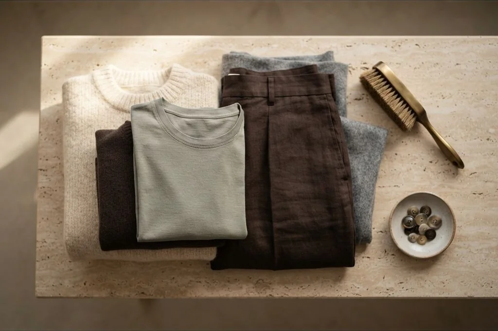
Color in an intentional wardrobe functions much like the tonal palette of an architecturally considered home. When hues are selected impulsively, visual dissonance occurs, making individual pieces difficult to pair. Developing disciplined capsule wardrobe color palette formulas removes this daily friction by establishing a cohesive color grammar. By anchoring your collection in warm neutrals, grounding darks, and organic earth accents, every top, bottom, and layer coordinates effortlessly. Discover more about our approach to intentional living and serene aesthetics across our Ornista curated home archives.
Key Takeaways
- The classic 60-30-10 palette formula balances sixty percent foundational neutrals, thirty percent secondary tonal hues, and ten percent subtle earth accents.
- Warm neutrals like ecru, oatmeal, taupe, and camel provide softer, more tactile versatility than stark stark white or pitch black.
- Grounding tones such as espresso, charcoal, and midnight blue establish structural weight without harsh visual severance.
- Earth accents inspired by natural landscapes – such as sage, terracotta, and olive – infuse quiet individuality into minimalist outfits.
- Texture differentiation allows head-to-toe monochromatic ensembles to feel multidimensional and refined.
The Architectural Triad: The 60-30-10 Rule in Dressing
Interior architects have long deployed the 60-30-10 ratio to achieve balanced spatial atmospheres. When translated into wardrobe architecture, this formula creates consistent visual equilibrium across diverse outfit combinations. Instead of choosing garments at random, you calibrate pieces according to their tonal role:
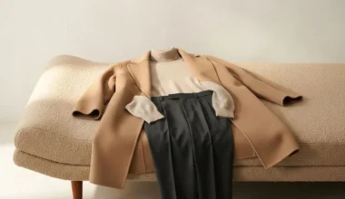
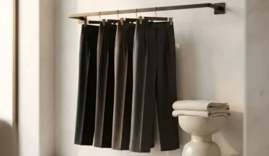
Sixty percent of your wardrobe consists of primary base neutrals. These are your foundational trousers, everyday overcoats, and prominent knitwear in shades like heather charcoal, warm taupe, or deep camel. Thirty percent represents secondary supporting neutrals, such as unbleached cotton shirting, biscuit-toned tees, and mid-wash indigo denim that soften transitions between pieces. The remaining ten percent belongs to accent pieces – silk pocket squares, woven scarves, or subtle leather accessories in muted organic hues.

Mastering Monochromatic and Tonal Nuances
Monochromatic styling is frequently misunderstood as wearing identical fabric swatches from head to toe. In reality, dressing in a single color family succeeds through subtle tonal gradation and tactile contrast. When assembling an all-cream ensemble, pairing a flat cotton poplin shirt with a smooth linen trouser can appear two-dimensional and sterile.
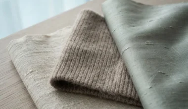
Instead, layer contrasting fiber densities. Introduce an unbleached linen shirt beneath a chunky ribbed cashmere sweater, grounded by heavy cotton canvas chinos in warm biscuit. The varying light absorption of open linen weaves against velvety brushed wool creates rich visual depth. For complementary organizational insights, reference our complete inventory breakdown in the 30-piece capsule wardrobe checklist.

Warm Neutrals Versus Cool Neutrals: Finding Your Baseline
Selecting the foundation of your capsule begins by determining whether warm or cool undertones dominate your aesthetic preferences. While both can coexist harmoniously, establishing a clear anchor prevents subtle clashing across daily outfits:
The warm minimalist palette
The warm minimalist spectrum draws inspiration from sun-drenched Scandinavian summers and natural travertine stone. Core base tones include creamy ivory, unbleached oat, honeyed camel, warm tobacco, and rich espresso. These hues pair seamlessly with brushed brass jewelry, untreated vegetable-tanned leather, and horn buttons, evoking an inviting, tactile serenity.
The cool architectural palette
The cool architectural palette reflects granite cliffs, stormy seas, and polished concrete. Foundation tones focus on crisp optical white, heather slate grey, deep graphite, and inky midnight navy. These colors harmonize with brushed steel timepieces, clean matte black footwear, and silver hardware, projecting sharp modern clarity.

Integrating Earth Accents Without Disrupting Cohesion
A minimalist wardrobe does not require banishing color entirely. Rather, it demands that colors reflect natural, desaturated organic pigments rather than synthetic neon brightness. Earth accents derived from moss, clay, dried eucalyptus, and mineral ochre infuse understated personality without compromising versatility.
When evaluating candidate accent garments, examine the underlying dyeing methodology. Garment-dyed cottons and yarn-dyed wools yield gentle micro-variations across the weave, softening the visual transition against neutral bottoms. These living variations reflect natural light with nuanced subtlety, avoiding the flat, artificial appearance typical of cheap vat-dyed synthetics.
When incorporating an accent piece – such as an olive wool chore jacket or a terracotta silk scarf – test it against at least three foundational neutrals in your collection. If the olive jacket pairs equally well with your ecru tee, grey trousers, and raw indigo denim, it belongs in the capsule. As celebrated lifestyle publication Kinfolk frequently explores, harmonizing clothing with natural tones fosters a seamless connection between personal space and daily life.

Tonal Transitions Across Seasonal Shifts
A major advantage of a well-calibrated color palette is its resilience across the calendar. When your garments share tonal warmth, you never need to pack away your entire wardrobe between summer and winter. A lightweight cream linen shirt worn unbuttoned over swimwear in July transitions seamlessly under a camel cashmere sweater and charcoal overcoat in November.
To master the art of combining weights and textures during fluctuating weather, study our step-by-step methodologies on transitional layering formulas. By maintaining consistent base tones, seasonal adaptation becomes a simple matter of shifting garment density rather than reinventing your palette.

Lighting Temperatures and Fabric Sheen Interaction
Color perception depends heavily on environmental illumination. A sweater that appears neutral taupe under natural morning daylight can cast an undesirable yellowish tint under harsh fluorescent office lamps. Natural fabrics respond uniquely to ambient color temperatures:
Silk twill and fine-gauge mercerized cotton reflect light with soft directional luster, amplifying color intensity. Conversely, brushed shetland wool and heavy linen scatter light diffusely, softening high-contrast hues into muted tones. Understanding these tactile dynamics mirrors our lighting philosophy in interior spaces, such as our recommendations for warm minimalist desk lighting, where balancing 2700K to 3000K illumination protects visual comfort.

Frequently Asked Questions
How many colors should be included in a capsule wardrobe?
A balanced capsule typically features three to four foundational neutrals (such as cream, charcoal, taupe, and espresso) supported by two complementary earth accents (such as sage or terracotta). Restricting the palette to five or six harmonious tones ensures complete cross-item compatibility.
Can black and navy be worn together in a minimalist capsule?
Yes, pairing black and midnight navy is an established hallmark of Parisian and Scandinavian styling. The combination works best when intentional texture contrast is present, such as pairing a matte black wool overcoat over an inky navy cashmere knit.
What if a favorite personal color is not considered a neutral?
Non-neutral colors can be integrated seamlessly if you select their desaturated or earthy variations. Rather than a vibrant cobalt blue, opt for slate blue or indigo; instead of bright forest green, choose muted olive or dried sage.
How do I test if a new garment fits my existing palette?
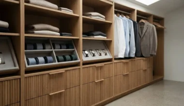
Conduct a simple three-outfit test before introducing any new piece. Lay the candidate garment against your current closet rail and confirm that it creates at least three effortless outfit formulas with existing items without needing new supporting accessories.
Mastering a disciplined color palette brings quiet serenity and effortless intention to your daily dressing routine. When every hue honors organic balance and tactile authenticity, personal style becomes an enduring reflection of calm.